Puka Market
It’s easy to recall your first encounter with a Puka shell necklace. For founder, Tiphanie Marbach, it’s an accessory that takes her back to when she was a little girl and found immense joy and freedom in dressing however she wanted to as long as it made her feel good. As she’s since grown up, she’s continued to harbor an affinity for the wild and funky side of fashion and jewelry and founded Puka Market. She brought me in to help polish up her brand story, build a cohesive visual identity system, and redesign all packaging touchpoints.
Role –
BRAND STRATEGY
BRAND IDENTITY
PACKAGING DESIGN
Team –
ANNIE YANG, CREATIVE DIRECTOR & DESIGNER
TIPHANIE MARBACK, FOUNDER
The existing logo was unique and carried a lot of potential, but the way it was being used fell a little flat–especially for a jewelry brand with a lot of spunk. The word mark was updated to quite literally, pop from the page, and embellished to allude to the industry of the brand.


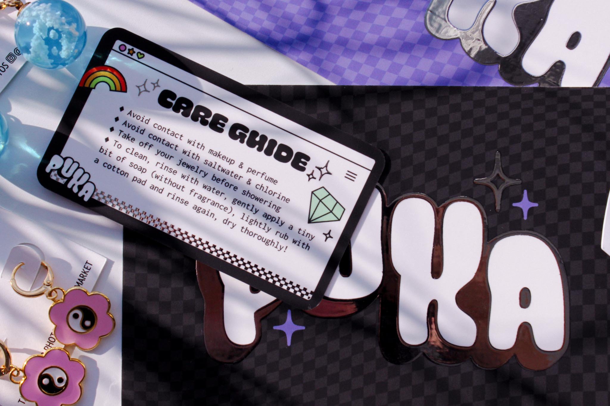
PACKAGING
Every packaging touchpoint of the brand was reimagined–from the jewelry box down to the earring and necklace cards. Each element was designed to carry through the playful, nostalgic, and funky energy of the brand and leave a memorable impression on customers.


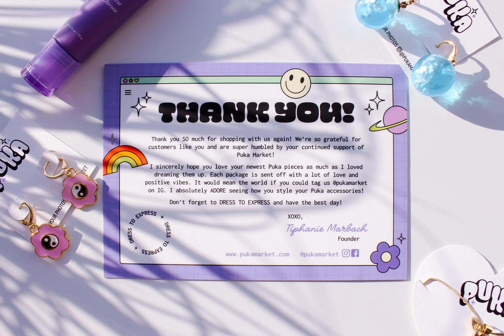
Thank You cards were packed with each jewelry order. Silver foil was used to add an extra sparkly touch and encourage customers to keep them as a work of art.