Nunchi
Nunchi is a Korean-American women-led fine jewelry brand that is committed to redefining luxury fine jewelry through sustainability and retail activism by partnering with artists and businesses that share their mission of impact awareness and cultural celebration. The brand's mission is inspired by the Korean concept of 'nunchi', which emphasizes the importance of awareness and balance. As Nunchi planned for its next phase of growth and impact, the brand sought to evolve its visual identity to authentically embody and celebrate its Korean-American roots and more effectively communicate the core values of the business.
All photography is courtesy of Nunchi.
Role –
BRAND IDENTITY
Team –
ANNIE YANG, CREATIVE DIRECTOR
JANE DUA, FOUNDER OF LIVE NUNCHI
SAMPLES OF OLD IDENTITY

ASPIRATIONS FOR THE NEW BRAND
“I'd love for Nunchi to aesthetically represent my Korean-American roots, as being an AAPI-owned brand that's both heritage and purpose-driven, is centric to our brand DNA.”

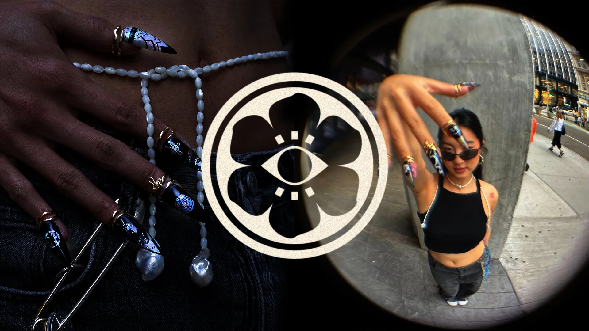
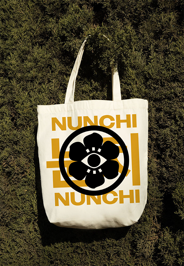
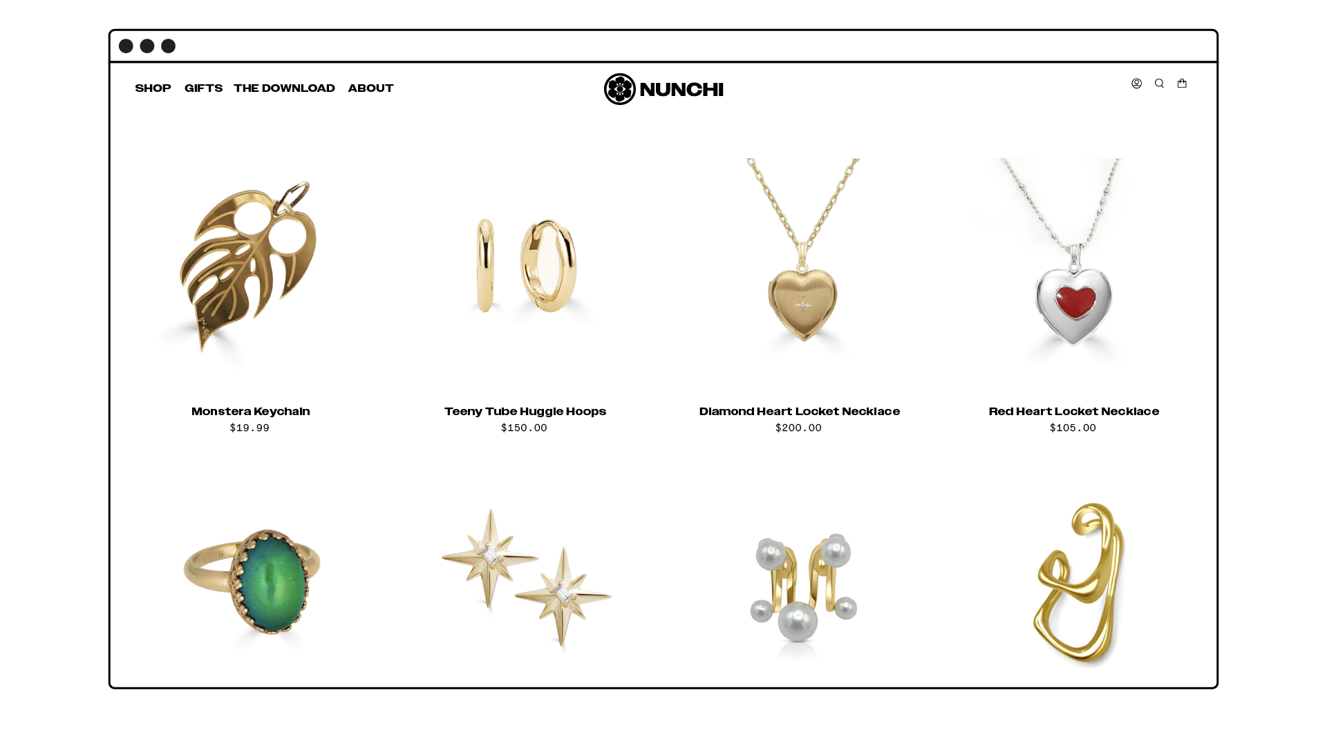
The new logo is inspired by the floral designs that adorn Korean temples, celebrating the brand's rich heritage. The eye symbolizes awareness (“nun” meaning eye in korean), while the logo's symmetry conveys a sense of balance– embodying the essence of 'nunchi.' To complement the symbol, we set the brand name in all uppercase and chose a typeface that channels the edgy spirit of New York City.


To ensure we brought in aspects of the city the founder was raised, the graphic language and photography both drew inspiration from elements and locations iconic to New York City.

The brand continually evolves its collections by partnering with AAPI artists, aiming to create an expansive, co-branded jewelry gallery at Nunchi.


As part of the brand relaunch, the symbol was transformed into a signet ring that is available for purchase on the Nunchi website.


